
ACADEMIC PROJECT
ACADEMIC PROJECT
ACADEMIC PROJECT
USER RESEARCH
USER RESEARCH
USER RESEARCH
UX/UI DESIGN
UX/UI DESIGN
UX/UI DESIGN
Book. Sit. Relax.
Book. Sit. Relax.
Book. Sit. Relax.
Your snacks are on the way.
Your snacks are on the way.
Your snacks are on the way.


01.
01.
01.
OVERVIEW
OVERVIEW
OVERVIEW
Role
Role
UX Researcher
UX Designer
UX Researcher
UX Designer
UX Researcher
UX Designer
Duration
Duration
4 weeks
Dec 2023 - January 2024
4 weeks
Dec 2023 - January 2024
4 weeks
Dec 2023 - January 2024
Skills
Skills
User Research
Visual Design
Motion Design
UX Research
Motion Design
Interaction Design
User Research
Visual Design
Motion Design
Context
Context
Although loved by many, online shopping can get overwhelming through an abundance of choice. Void looks to stand out by offering an efficient, convenient, and visually engaging shopping experience.
This project was created as part of my Google UX Certificate.
Although loved by many, online shopping can get overwhelming through an abundance of choice. Void looks to stand out by offering an efficient, convenient, and visually engaging shopping experience.
This project was created as part of my Google UX Certificate.
Although loved by many, online shopping can get overwhelming through an abundance of choice. Void looks to stand out by offering an efficient, convenient, and visually engaging shopping experience.
This project was created as part of my Google UX Certificate.
Problem
Problem
Online shopping can get confusing due to unclear navigation, too many options, and lack of visual merchandising.
Online shopping can get confusing due to unclear navigation, too many options, and lack of visual merchandising.
Online shopping can get confusing due to unclear navigation, too many options, and lack of visual merchandising.
Goal
Goal
Void looks to keep online shopping as efficient as possible with intuitive navigation, visual merchandising and a seamless-cross device experience. With Void, users can shop at home or on the go without wasting a second more than needed.
Void looks to keep online shopping as efficient as possible with intuitive navigation, visual merchandising and a seamless-cross device experience. With Void, users can shop at home or on the go without wasting a second more than needed.
Void looks to keep online shopping as efficient as possible with intuitive navigation, visual merchandising and a seamless-cross device experience. With Void, users can shop at home or on the go without wasting a second more than needed.
02.
02.
02.
RESEARCH
RESEARCH
RESEARCH
I conducted user interviews, which I later applied into empathy maps to establish a range of profiles and needs of every user.
One discovery that stood out to me was the importance of brand loyalty, where the look and feel of a website had a lot of influence on a user’s attachment. If the website was aesthetically pleasing and robust, their products brought a more premium and reliable feeling - premium through material quality and reliable through genuinity in quality and delivery. Additionally, the safer and more comfortable a user feels, the more likely it is for them to apply for a membership to further quicken and simplify purchases.
I conducted interviews and created empathy maps to discover user pain points. The main user group identified through research were young adults or teens.
Although this user group confirmed my initial assumptions, I noticed that there was a secondary group that consisted of guardians accompanying underage children. This group inherently introduces working class adults and more members of the primary user group to accompany the children. This secondary group shares all the needs of the primary group on top of some additional ones.
Paint points
Paint points
Paint points

Navigation
Navigation
An unclear navigation increases user errors from confusion and stress about handling user information and spending money.
An unclear navigation increases user errors from confusion and stress about handling user information and spending money.
An unclear navigation increases user errors from confusion and stress about handling user information and spending money.

Browsing
Browsing
Clustering hinders users from focusing on a single product, discouraging them from spending more time to check all products.
Clustering hinders users from focusing on a single product, discouraging them from spending more time to check all products.
Clustering hinders users from focusing on a single product, discouraging them from spending more time to check all products.

Responsiveness
Responsiveness
Whether at home on a laptop or outside on a phone, users should be confident about getting the best website quality on any screen size.
Whether at home on a laptop or outside on a phone, users should be confident about getting the best website quality on any screen size.
Whether at home on a laptop or outside on a phone, users should be confident about getting the best website quality on any screen size.
User Persona: Toby
User Persona: Toby
User Persona: Toby
Using these newly discovered paint points, I created a user persona that is hindered by all of them to find goals and frustrations that provide solutions Void can focus on.
Using these newly discovered paint points, I created a user persona that is hindered by all of them to find goals and frustrations that provide solutions Void can focus on.
Using these newly discovered paint points, I created a user persona that is hindered by all of them to find goals and frustrations that provide solutions Void can focus on.
Toby's problem statement
Toby's problem statement
Toby is a busy junior employee, who needs a simple and efficient online shopping experience because he wants to use his newly disposable income while leading a busy lifestyle.
Toby is a busy junior employee, who needs a simple and efficient online shopping experience because he wants to use his newly disposable income while leading a busy lifestyle.
Toby is a busy junior employee, who needs a simple and efficient online shopping experience because he wants to use his newly disposable income while leading a busy lifestyle.

Toby
Toby
Age:
Pronouns:
Occupation:
Hometown:
Family:
Age:
Pronouns:
Occupation:
Hometown:
Family:
23
he/him
Junior consultant
Chicago, USA
2 parents, 1 older brother
23
he/him
Junior consultant
Chicago, USA
2 parents, 1 older brother
“I love fashion as a way to express myself, especially streetwear. A website that offers a wide selection of unique and stylish options, along with a smooth shopping experience, would be perfect for my busy lifestyle.”
“I love fashion as a way to express myself, especially streetwear. A website that offers a wide selection of unique and stylish options, along with a smooth shopping experience, would be perfect for my busy lifestyle.”
Goals
Effortless browsing
Toby prefers a straightforward layout that helps him avoid cluttered pages.
Toby prefers a straightforward layout that helps him avoid cluttered pages.
Streamlined checkout
Toby appreciates when completing a purchase is quick and hassle-free.
Toby appreciates when completing a purchase is quick and hassle-free.
Product information
Clear product descriptions, sizing charts, and high-quality images help assess quality and suitability of products.
Clear product descriptions, sizing charts, and high-quality images help assess quality and suitability of products.
Frustrations
Confusing navigation
Toby can be overwhelmed by the abundance of options.
Toby can be overwhelmed by the abundance of options.
Quality assurance
Toby seeks assurance that the products he purchases meet his expectations in terms of quality.
Toby seeks assurance that the products he purchases meet his expectations of quality.
Technical reliability
Toby prefers a platform that is stable and reliable, ensuring smooth and uninterrupted browsing and checkout.
Toby prefers a platform that is stable and reliable, ensuring smooth and uninterrupted browsing and checkout.
User journey map
This journey map visualizes the average experience with Void's website while highlighting moments affected by pain points. I analyse the user journey to make informed solutions to optimize the user experience and enhance overall satisfaction down into the design phase.
This journey map visualizes the average experience with Void's website while highlighting moments affected by pain points. I analyse the user journey to make informed solutions to optimize the user experience and enhance overall satisfaction down into the design phase.

Toby
Age:
Pronouns:
Occupation:
Hometown:
Family:
23
he/him
Junior consultant
Chicago, USA
2 parents, 1 older brother
“I love fashion as a way to express myself, especially streetwear. A website that offers a wide selection of unique and stylish options, along with a smooth shopping experience, would be perfect for my busy lifestyle.”
Goals
Effortless browsing
Toby prefers a straightforward layout that helps him avoid cluttered pages.
Streamlined checkout
Toby appreciates when completing a purchase is quick and hassle-free.
Product information
Clear product descriptions, sizing charts, and high-quality images help assess quality and suitability of products.
Frustrations
Confusing navigation
Toby can be overwhelmed by the abundance of options.
Quality assurance
Toby seeks assurance that the products he purchases meet his expectations in terms of quality.
Technical reliability
Toby prefers a platform that is stable and reliable, ensuring smooth and uninterrupted browsing and checkout.
User journey map
This journey map visualizes the average experience with Void's website while highlighting moments affected by pain points. I analyse the user journey to make informed solutions to optimize the user experience and enhance overall satisfaction down into the design phase.
03.
03.
03.
DESIGN
DESIGN
DESIGN
I create a sitemap, paper and digital wireframes for different screen sizes, low-fidelity prototypes, and conduct usability studies to finalize and present a high-fidelity prototype.
I create a sitemap, paper and digital wireframes for different screen sizes, low-fidelity prototypes, and conduct usability studies to finalize and present a high-fidelity prototype.
I create a sitemap, paper and digital wireframes for different screen sizes, low-fidelity prototypes, and conduct usability studies to finalize and present a high-fidelity prototype.
Sitemap
Sitemap
Sitemap
For an e-commerce website, I found that a hierarchical sitemap provides the best navigation for online shopping. The left side of the navigation is dedicated to browsing with three different tabs: shop, lookbooks and search.
For an e-commerce website, I found that a hierarchical sitemap provides the best navigation for online shopping. The left side of the navigation is dedicated to browsing with three different tabs: shop, lookbooks and search.
For an e-commerce website, I found that a hierarchical sitemap provides the best navigation for online shopping. The left side of the navigation is dedicated to browsing with three different tabs: shop, lookbooks and search.

The right side contains tabs for managing purchases, setting language, and finding information. Lastly, a cart tab is located at the end to wrap up the shopping experience. This provides a simple navigation that highlights browsing to keep the users’ shopping experience as efficient as possible.
The right side contains tabs for managing purchases, setting language, and finding information. Lastly, a cart tab is located at the end to wrap up the shopping experience. This provides a simple navigation that highlights browsing to keep the users’ shopping experience as efficient as possible.
The right side contains tabs for managing purchases, setting language, and finding information. Lastly, a cart tab is located at the end to wrap up the shopping experience. This provides a simple navigation that highlights browsing to keep the users’ shopping experience as efficient as possible.
Paper wireframes
Paper wireframes
Paper wireframes
After researching user pain points, I sketched out different iterations of paper wireframes for every screen.
After researching user pain points, I sketched out different iterations of paper wireframes for every screen.
After researching user pain points, I sketched out different iterations of paper wireframes for every screen.
The product browsing screen was one of the main focuses in my paper wireframes. I ideated through many layouts and features, as I looked to create a browsing experience that can clearly showcase products while still providing space for navigation and a filter feature for personalization.
The product browsing screen was one of the main focuses in my paper wireframes. I ideated through many layouts and features, as I looked to create a browsing experience that can clearly showcase products while still providing space for navigation and a filter feature for personalization.
The product browsing screen was one of the main focuses in my paper wireframes. I ideated through many layouts and features, as I looked to create a browsing experience that can clearly showcase products while still providing space for navigation and a filter feature for personalization.

#1
Category carousel and large browsing list

#2
Quickview for browsing list

#3
Filter options sidebar

#4
Filter button and collection slideshow
#1
Category carousel and large browsing list
#2
Quickview for browsing list
#3
Filter options sidebar
#4
Filter button and collection slideshow
#1
#2
#3
#4
To best showcase products, I decided to include a quick view for users to preview selected products and their descriptions before entering the product page. Paired with a filter option, I found this solution to make browsing as efficient as possible. For quick navigation, a collection list populates the top of the website while the top bar is minimized for additional options.
To best showcase products, I decided to include a quick view for users to preview selected products and their descriptions before entering the product page. Paired with a filter option, I found this solution to make browsing as efficient as possible. For quick navigation, a collection list populates the top of the website while the top bar is minimized for additional options.
To best showcase products, I decided to include a quick view for users to preview selected products and their descriptions before entering the product page. Paired with a filter option, I found this solution to make browsing as efficient as possible. For quick navigation, a collection list populates the top of the website while the top bar is minimized for additional options.


Mobile variant
Mobile variant
Mobile variant
As I finalized plans for the desktop website, I began to visualize it on a slimmer mobile screen.
As I finalized plans for the desktop website, I began to visualize it on a slimmer mobile screen.
As I finalized plans for the desktop website, I began to visualize it on a slimmer mobile screen.
With a thinner form factor, the most important change was keeping all essential features while maintaining accessibility as a phone user.
Browsing being the primary focus, the product list is placed at the bottom where it is most reachable. All navigation features were horizontally minimized to provide space for the quickview.
Digital wireframes
Digital wireframes
Digital wireframes
As I digitally recreate my wireframes on Figma, I apply some early ideas to improve user experience.
As I digitally recreate my wireframes on Figma, I apply some early ideas to improve user experience.
As I digitally recreate my wireframes on Figma, I apply some early ideas to improve user experience.

Quick view
Products are showcased early to inspire user purchasing decisions without entering the product page
Products are showcased early to inspire user purchasing decisions without entering the product page
Quick view
Products are showcased early to inspire user purchasing decisions without entering the product page

Filter products
Users can focus on finding what they want without being overwhelmed by too many choices
Users can focus on finding what they want without being overwhelmed by too many choices
Filter products
Users can focus on finding what they want without being overwhelmed by too many choices

Collection list
Provides users with context and easily accessable navigation options to explore similar products
Provides users with context and easily accessable navigation options to explore similar products
Collection list
Provides users with context and easily accessable navigation options to explore similar products
Mobile variant
Mobile variant
Mobile variant
After creating digital wireframes for desktop users, I created a mobile variant using earlier paper wireframes.
After creating digital wireframes for desktop users, I created a mobile variant using earlier paper wireframes.
After creating digital wireframes for desktop users, I created a mobile variant using earlier paper wireframes.

Product list placement
Product list
Placing the product list at the bottom supports reachability when browsing on a mobile screen
Placing the product list at the bottom supports reachability when browsing on a mobile screen
Product list placement
Placing the product list at the bottom supports reachability when browsing on a mobile screen

Minimized navigation
The collections list is minimized to make space for visual features such as the quickview and product list
The collections list is minimized to make space for visual features such as the quickview and product list
Minimized navigation
The collections list is minimized to make space for visual features such as the quickview and product list

Expandable top bar
With less real estate for the top bar, it is now expandable to let users focus more on browsing
With less real estate for the top bar, it is now expandable to let users focus more on browsing
Expandable top bar
With less real estate for the top bar, it is now expandable to let users focus more on browsing
Low-fidelity prototype
Low-fidelity prototype
Low-fidelity prototype
User flow
The website's userflow is mostly a typical linear userflow, with additional options for settings, support and brand information. As users are making a purchase, they will progress through their experience in a sequencial manner.
The website's userflow is mostly a typical linear userflow, with additional options for settings, support and brand information. As users are making a purchase, they will progress through their experience in a sequencial manner.

Desktop variant
Desktop variant


Mobile variant
Mobile variant
Mobile variant


Usability study
Usability study
Usability study
Using my low-fidelity prototype, I conducted interviews with multiple participants for my usability study to gather findings about the app.
Using my low-fidelity prototype, I conducted interviews with multiple participants for my usability study to gather findings about the app.
Using my low-fidelity prototype, I conducted interviews with multiple participants for my usability study to gather findings about the app.
Study details
Study details
Study details
Research Qs
Research Qs
Did you find the website easy to navigate? Why or why not?
Did you find the website easy to navigate? Why or why not?
Did you find the navigation menu intuitive for browsing different product categories?
Did you find the navigation menu intuitive for browsing different product categories?
Were there any technical issues that affected your browsing experience?
Were there any technical issues that affected your browsing experience?
Are there any parts in the user flow that users get stuck on?
Are there any parts in the user flow that users get stuck on?
What improvements or changes would you suggest to enhance the user experience of the website?
What improvements or changes would you suggest to enhance the user experience of the website?
Participants
Participants
5 participants
5 participants
Aged between 16 to 32
Aged between 16 to 32
Participants regularly shop online
Participants regularly shop online
One participant is to be someone with physical impairment
One participant is to be someone with physical impairment
Methodology
Methodology
20-30 minutes per participant
20-30 minutes per participant
Online, remote
Online, remote
Unmoderated usability study
Unmoderated usability study
Users were asked to perform tasks on a low-fidelity prototype
Users were asked to perform tasks on a low-fidelity prototype
1 round of usabilty study will take place
1 round of usabilty study will take place
Findings

Edit cart items
Before or after adding to cart, users aren’t able to edit the item they want to buy nor their amount.
Before or after adding to cart, users aren’t able to edit the item they want to buy nor their amount.
Edit cart items
Before or after adding to cart, users aren’t able to edit the item they want to buy nor their amount.

Image variations
Users want to see multiple pictures of a product to gain a better idea of its look and quality.
Users want to see multiple pictures of a product to gain a better idea of its look and quality.
Image variations
Users want to see multiple pictures of a product to gain a better idea of its look and quality.

Order information
Users require as much information before purchasing as after, ensuring that the products are credible.
Users require as much information before purchasing as after, ensuring that the products are credible.
Order information
Users require as much information before purchasing as after, ensuring that the products are credible.
04.
04.
04.
PROTOTYPE
PROTOTYPE
PROTOTYPE
Mockups
Mockups
Mockups
After the second round of usability tests, I gained much more insight about possible improvements. With these new ideas, I got to finalizing my high-fidelity prototype.
After the second round of usability tests, I gained much more insight about possible improvements. With these new ideas, I got to finalizing my high-fidelity prototype.
After the second round of usability tests, I gained much more insight about possible improvements. With these new ideas, I got to finalizing my high-fidelity prototype.
Edit cart items
To account for users' changes in decision, size, color and amount are now editable from the cart summary, as well as a tab to remove or return to the item's product page.
To account for users' changes in decision, size, color and amount are now editable from the cart summary, as well as a tab to remove or return to the item's product page.
Edit cart items
To account for users' changes in decision, size, color and amount are now editable from the cart summary, as well as a tab to remove or return to the item's product page.


Image variations
Before purchasing a product, users are able to see multiple angles and close-ups of the item to fully assess if the look and quality meet their liking.
Before purchasing a product, users are able to see multiple angles and close-ups of the item to fully assess if the look and quality meet their liking.
Image variations
Before purchasing a product, users are able to see multiple angles and close-ups of the item to fully assess if the look and quality meet their liking.
Order information
After making their purchase, users will be reassured that their order has been processed by receiving the date and order number, in case they have inquiries about their purchase and peace of mind.
After making their purchase, users will be reassured that their order has been processed by receiving the date and order number, in case they have inquiries about their purchase and peace of mind.
Order information
After making their purchase, users will be reassured that their order has been processed by receiving the date and order number, in case they have inquiries about their purchase and peace of mind.

Accessibility
Accessibility
Accessibility
Navigation being an essential part of the website, I made it accessible for users requiring assistive technology.
Navigation being an essential part of the website, I made it accessible for users requiring assistive technology.
Navigation being an essential part of the website, I made it accessible for users requiring assistive technology.

Alt-Text
Users with low-vision can learn the content of images and the context and purpose within the content.
Users with low-vision can learn the content of images and the context and purpose within the content.
Alt-Text
Users with low-vision can learn the content of images and the context and purpose within the content.

Landmarks
Users with screen readers can learn the page layout and organization to effortlessly navigate.
Users with screen readers can learn the page layout and organization to effortlessly navigate.
Landmarks
Users with screen readers can learn the page layout and organization to effortlessly navigate.

Focus order
Users can use the keyboard to navigate in a sequential manner for orientation and easy interaction.
Users can use the keyboard to navigate in a sequential manner for orientation and easy interaction.
Focus order
Users can use the keyboard to navigate in a sequential manner for orientation and easy interaction.
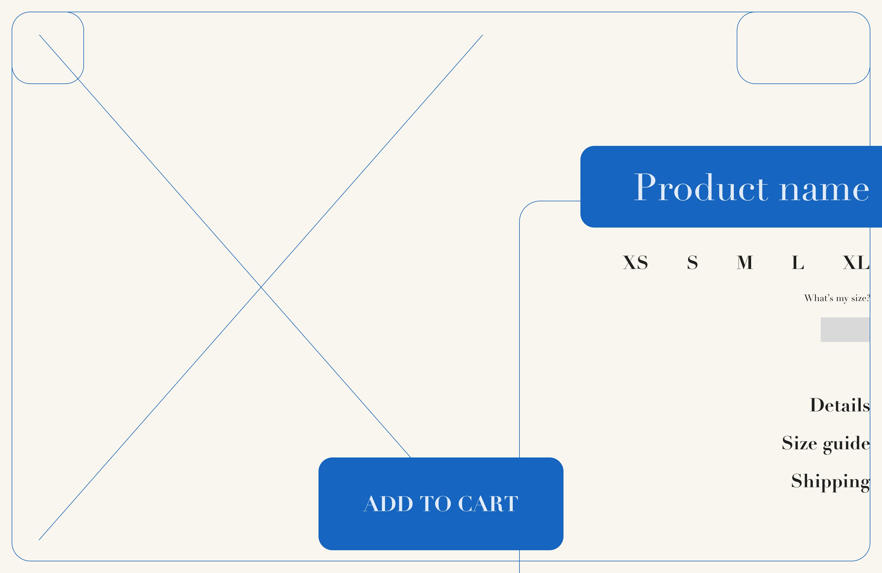
High-fidelity prototype
High-fidelity prototype
High-fidelity prototype
With all these changes in mind, I finalized me high-fidelity prototype:
With all these changes in mind, I finalized me high-fidelity prototype:
With all these changes in mind, I finalized me high-fidelity prototype:
05.
05.
05.
REFLECT
REFLECT
REFLECT
Takeaways
Takeaways
Takeaways
Impact
Impact
Our target users shared that the changes applied from the usability test, along with the new look of the website, greatly improve their experience. From a functional standpoint, navigating and browsing were more optimized through access, filtering and editing items. Additionally, landmarks, alt text and focus points were added to provide accessibility and were greatly appreciated by our tester with physical impairments.
Our target users shared that the changes applied from the usability test, along with the new look of the website, greatly improve their experience. From a functional standpoint, navigating and browsing were more optimized through access, filtering and editing items. Additionally, landmarks, alt text and focus points were added to provide accessibility and were greatly appreciated by our tester with physical impairments.
Our target users shared that the changes applied from the usability test, along with the new look of the website, greatly improve their experience. From a functional standpoint, navigating and browsing were more optimized through access, filtering and editing items. Additionally, landmarks, alt text and focus points were added to provide accessibility and were greatly appreciated by our tester with physical impairments.
What I learned
What I learned
One of my main takeaways is dedicating more time into ideating before creating wireframes. As a designer that loves to visualize everything, I often focus too much on seeing implementations. Knowing that, I forced myself to spend more time brainstorming and writing down ideas as much as I could before drawing up wireframes. I noticed a significant improvement in my work efficiency, as I was designing with more confidence and creativity. This is mainly because I allowed myself to plan ahead of multiple cases so that I could focus on progressing rather than readjusting.
One of my main takeaways is dedicating more time into ideating before creating wireframes. As a designer that loves to visualize everything, I often focus too much on seeing implementations. Knowing that, I forced myself to spend more time brainstorming and writing down ideas as much as I could before drawing up wireframes. I noticed a significant improvement in my work efficiency, as I was designing with more confidence and creativity. This is mainly because I allowed myself to plan ahead of multiple cases so that I could focus on progressing rather than readjusting.
One of my main takeaways is dedicating more time into ideating before creating wireframes. As a designer that loves to visualize everything, I often focus too much on seeing implementations. Knowing that, I forced myself to spend more time brainstorming and writing down ideas as much as I could before drawing up wireframes. I noticed a significant improvement in my work efficiency, as I was designing with more confidence and creativity. This is mainly because I allowed myself to plan ahead of multiple cases so that I could focus on progressing rather than readjusting.
Next steps
Next steps
Next steps
After reflecting on my work, here are the next steps I'd like to take:
After reflecting on my work, here are the next steps I'd like to take:
After reflecting on my work, here are the next steps I'd like to take:

More usability tests
Conducting a follow-up usability study will allow me to see how to cater towards more needs and improve existing ones.
Conducting a follow-up usability study will allow me to see how to cater towards more needs and improve existing ones.
More usability tests
Conducting a follow-up usability study will allow me to see how to cater towards more needs and improve existing ones.

Contrast
The text, despite being visible for most, might still be an issue for users with low vision or colorblindness.
The text, despite being visible for most, might still be an issue for users with low vision or colorblindness.
Contrast
The text, despite being visible for most, might still be an issue for users with low vision or colorblindness.

Loyalty program
The first feature I would add are customer rewards, so that users are incentivized to return.
The first feature I would add are customer rewards, so that users are incentivized to return.
Loyalty program
The first feature I would add are customer rewards, so that users are incentivized to return.
